Case Study
The Shining Movie Website
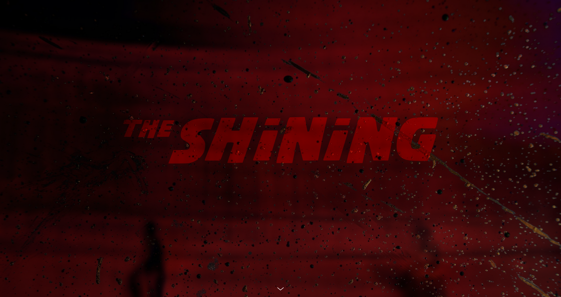
A UI design course project focused on translating the atmosphere of a classic horror film into a long-scroll editorial website experience.
Role
UI Designer
Course
UI Design
Focus
Mood, typography, hierarchy, long-scroll structure, and cinematic page composition
Overview
Project summary
This project was created during my UI design course as a website concept based on the movie The Shining. The goal was to design an interface that felt cinematic and immersive while still organizing a large amount of content in a clear and readable way.
Instead of making it feel like a standard movie information page, I approached it more like a visual editorial experience. The design used a dark atmosphere, red accents, strong section headings, and image placement that reflected the tension and mood of the film.
Challenge
What needed to be solved
The main challenge was balancing style with readability. Because the website was inspired by a horror film, it needed to feel dramatic and visually intense, but the content still had to remain structured and easy to follow.
Another challenge was handling a long-scroll layout with many sections such as introduction, characters, location, themes, and analysis. I had to create enough contrast and hierarchy so users would not feel lost as they moved through the page.
Process
Design decisions
Visual mood
I used a dark background with red accent typography to reflect the unsettling tone of the film. This helped create a strong visual identity and made the theme feel connected to the movie’s genre.
Typography and hierarchy
Large uppercase section titles were used to break the page into clear content blocks. Smaller body text and supporting images helped create rhythm throughout the layout, making the long page feel more intentional and easier to scan.
Layout structure
I designed the page to feel like a story unfolding as the user scrolls. Alternating text blocks, image placements, and section breaks helped keep the experience visually engaging while supporting the narrative of the content.
Outcome
What I learned
This project helped me improve my understanding of visual storytelling in web design. I learned how color, spacing, typography, and image rhythm can shape the emotional tone of a digital experience.
It also strengthened my confidence in designing longer layouts with multiple sections. I became more aware of how to guide users through content without losing clarity, even when the design is highly mood-driven.
Portfolio Navigation
Continue through the portfolio
Link this section to another case study from your main portfolio once you decide where this project sits in the order.