Case Study
Brand Identity System
A personal branding project for armn Graphics & Visuals built to feel modern, flexible, and memorable across digital and print applications.
Role
Brand Designer
Timeline
Student / Personal Project
Focus
Typography, visual hierarchy, color direction, and adaptable identity design
Overview
Project summary
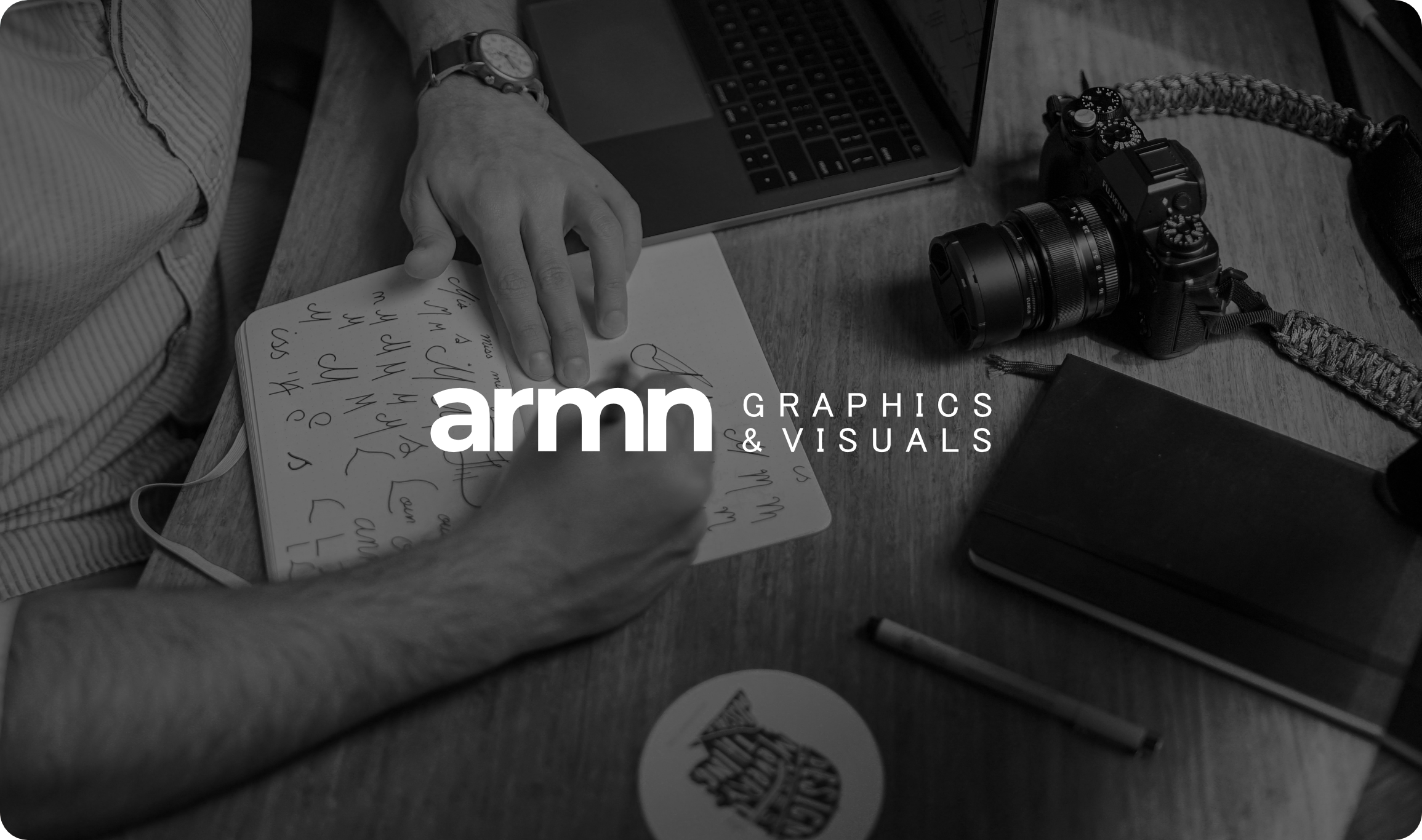
This project focused on creating a personal brand identity for armn Graphics & Visuals. The goal was to build a logo and visual direction that felt professional and creative while staying flexible enough to work across social media, web, and printed materials.
I wanted the identity to feel simple but distinctive. Instead of making it overly decorative, I focused on strong typography, clean spacing, and a controlled color palette that could stay recognizable in different applications.
Challenge
What needed to be solved
The main challenge was creating a brand that looked modern and polished without losing personality. It needed to work in different sizes and contexts, from profile icons and headers to mockups and business materials.
Another challenge was balancing simplicity with impact. The identity had to remain clean, but still feel intentional and memorable enough to stand on its own.
Process
Design decisions
Typography
I used a bold lowercase sans-serif style for “armn” to create a modern and approachable look. I paired it with a lighter uppercase treatment for the supporting text so the hierarchy felt clear and balanced.
Color direction
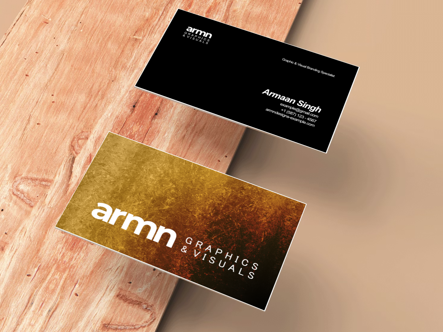
The palette used a monochrome base with an orange accent. This gave the identity a clean foundation while adding enough energy to make it stand out.
Adaptability
The design system was kept flexible so it could work across digital and print use. I considered how it would appear in icons, headers, mockups, and supporting materials rather than treating the logo as a single isolated graphic.
Gallery
Supporting visuals
Outcome
What I learned
This project helped me understand how identity design goes beyond making a logo look good. It taught me how important consistency, hierarchy, and usability are when building a brand system.
It also improved my ability to create design work that feels intentional across different touchpoints. The final result became a strong foundation for presenting myself and my work more professionally.
Portfolio Navigation
Continue through the portfolio
Link this section to another case study from your main portfolio once you decide where this project sits in the order.